2010-05-26 Dutch Political Web Sites 2010
Dutch National Elections 2010
national elections
Two weeks from now, on 2010 June 9, the Dutch will vote to elect the 150 members of the Lower Chamber. Many voters will check out the political web sites for information. The
elections are once again an occasion to review the technical quality of the
national web sites.
Last year, in the context of European elections, Dutch Political Web Sites 2009
looked at both the national sites and the European sites of the various
parties. This time it is about the national sites only.
On 2010 April 29, the Kiesraad (Electoral Council)
initially approved and numbered 19 political parties, but on 2010 May 18 number 11
was declared invalid because they did not present their list of candidates in
time, leaving 18 parties to choose from.
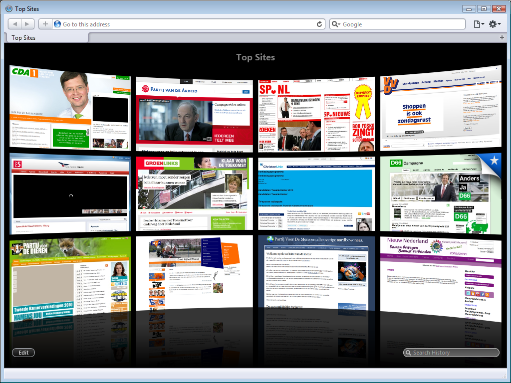
This overview looks at the websites for all 19 parties, including list 11.
browsers
There are four major web browsers: Opera, Firefox, Safari and Chrome. Early betas for Internet Explorer 9 show it to be a web browser too, but Internet Explorer 9 has not been released yet. Last year, the sites were tested in Mozilla Firefox 3.0.10 with NoScript. This year, the sites are tested in Apple Safari.
Once again, the browser is sized to 1024 x 768, as that is reasonably the
smallest resolution that you can expect a visitor to have these days.
Many users do have higher-resolution screens. To maximise the viewport size
without reducing the browser’s usability too much, the status bar and tab bar
are shown, but the menu bar and bookmarks bar are
hidden.
Safari was run without any add-ons, and all the non-standard stuff was turned off; Java, JavaScript and all plug-ins (most notably QuickTime and Flash) were turned off. After all, the sites should be created using web standards, be JavaScript-free and not rely on any proprietary technologies that require plug-ins.
Although Safari supports Flash on both Windows and MacOS, Safari Mobile does not. The screenshots below are pretty much what these site look like on an iPhone or iPad. I am pretty sure that several party leaders will be unpleasantly surprised by how bad their site is.
issues
I once again considered three things; an overall impression of the site and its navigation, how easy it is to find their viewpoints or party program and - the real reason for this overview - a look at the technical quality of the site. This is mostly done by examining whether the home pages are valid or not and a brief look at the home page source. All validation was performed with the W3C Mark-up Validation Service.
I paid particular attention to sites that claim to comply with standards. Last year, I found that the De Groenen (a Dutch European party) and SP lied that their sites complied with standards, while in actual fact their sites did not.
sites
1. Christen Democratisch Appèl (CDA)
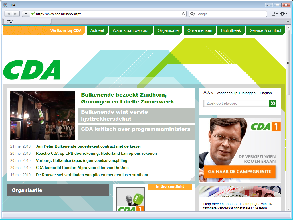
The site has been redone since 2009. The new site does without last year’s pathetic
drawings, but still includes the pukey yellow-green in a huge
background graphic as well as splotches of the eye-hurting orange. The
background graphic is not only impressively ugly, but in a style that
simply does not fit the CDA image at all.
If you left out the logo and
replaced all text by lorem ipsum, you would never guess
that this is the official site of the largest political party, as it looks like the
firt-time effort of a kid who played with a copy of Microsoft Expression
Web. This painfully ugly site is still a prime example of angry fruit salad;
a busy mess of clashing colours.
The homepage is more outgoing than
before; more about current topics of general interest, and less about internal party stuff.
Lots of links to stuff you might be interested in have conveniently been collected in the
footer.
The party logo is still strewn all over the front page. The menu along the top
is clear, and it is easy to find this party’s opinion on a wide range of
subjects, but the switch to another page often takes multiple seconds. The
top-level menu works, but does not show additional menus as intended. There is a
Standpunten op alfabet
(Viewpoint on Alphabet) menu on the Waar staan we voor
page, but that menu does not work either.
technology
The new site isn’t an improvement on the old one. Not only is the site remarkably slow to load pages, but it still relies on JavaScript - which is why several parts of the site do not work at all.
The site claims to use XHTML 1.0 Strict, but does not validate.
The W3C Validator reports 21 errors and 10 warnings for the home page alone. The
quality of the source is so-so; it lacks mandatory alt attributes, and is
full of non-existent attributes as well as references to non-existent entities.
That this horrible mess is the brand new website of the biggest and richest political party in the Netherlands is a crying shame.
election site
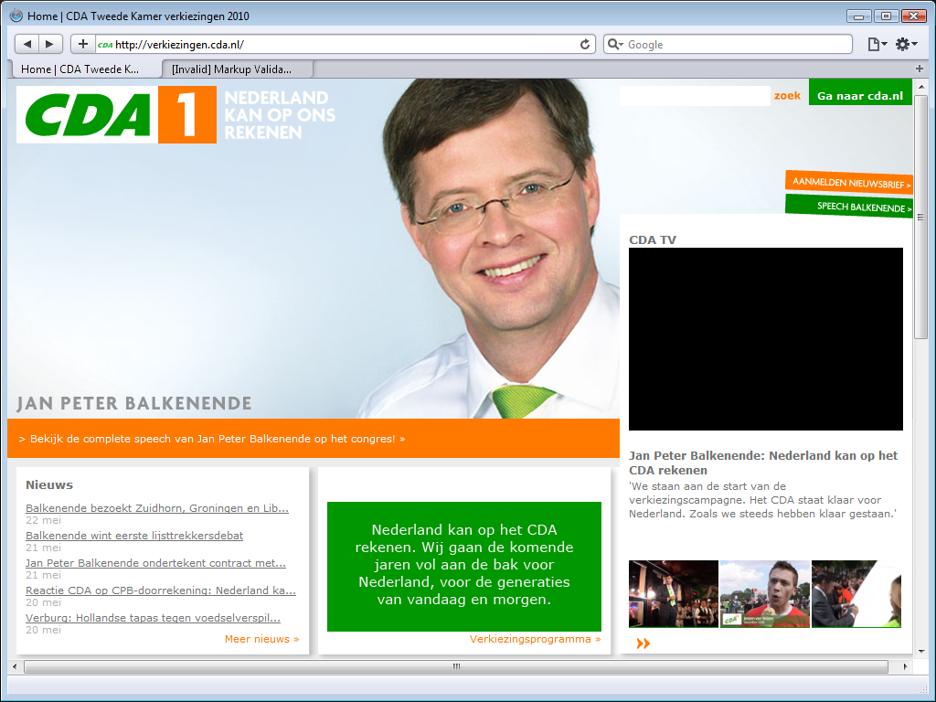
The CDA has a special election site on a subdomain. If you surf to www.cda.nl, you
are automatically redirected to verkiezingen.cda.nl. Notice the scroll bars:
while the main CDA site fits nicely within the browser’s viewport, this election
site does not.
The black box on the right side, below CDA TV
, is a Flash video on
YouTube for which they did not even include a picture placeholder.
This screenshot shows Jan-Peter Balkenende, the party leader. The site is
supposed to rotate between candidates, but that does not work either.
2. Partij van de Arbeid (PvdA)
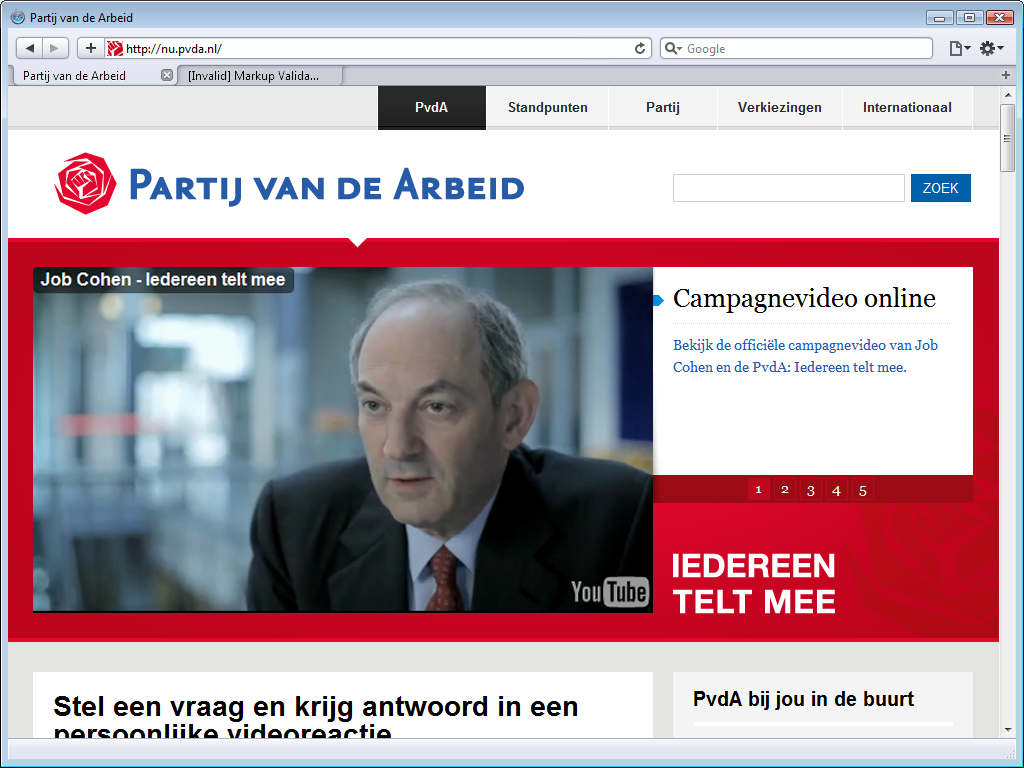
The Partij van de Arbeid (Labour Party) has a new site too and it looks a lot better - better than the CDA site and better than their old site. Problem is, practically everything you see when you surf to this site is looks. There is hardly any real content in view because the single large image that dominates the screenshot pushes all other content down. For the elections, that image is a placeholder for a YouTube video. Clicking it is senseless; it is a flash video and that does not work.
When you do scroll down, recent blog posts are on the left, and a small column on the right holds a blog roll, an agenda, and some buttons. Lots of links to various stuff have been collected in the footers. It is a simple, clear design, but with many gaping holes - literally. Many topics have a minimal amount of text followed by large white holes where a video is goes; it does not even show a placeholder image.
The PvdA site is of uneven quality. The top video has a placeholder image, other videos have not. Some blog posts use Flash movie, thus demanding that the visitor install Adobe Flash, other blog posts use Microsoft Silverlight movies, thus demanding that the user install Microsoft Silverlight. It makes the site visitor-unfriendly.
navigation
The menu along the top includes a standpunten
menu item
that leads directly to a page with political topics and when you click any of
these, you get a page of text with the PvdA’s viewpoint on that topic. Unlike
the CDA’s botched attempt at same, the topic selection works fine without
demanding that you browse unsafely by enabling JavaScript.
white space
The PvdA really seems to love whitespace, the source for their home
page is full of it; their homepage contains kilobytes of
superfluous tabs and spaces. That is kilobytes of bandwidth wasted
every time someone visits their site.
It may be hard not to wonder whether the web design firm they hired for their web
site hates this party and did this deliberately to increase their bandwidth
costs, but the surprising fact is that this particular shortcoming is shared by
many of the political sites.
election pages
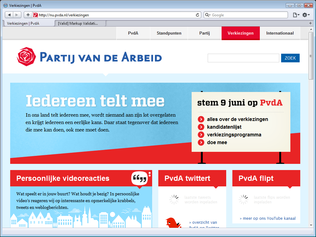
The PvdA has special election pages. They call it an election site, but it
actually are pages on their main site. That is how it should be. I don’t want to
hop back and forth between sites to figure out what information is on which
site.
However, in some sense it really is a different site. As the screenshot shows,
the style of these pages is not identical to that of the rest of the PvdA site.
There are similarities, but it is not the same.
The image shows two wait cursors that keep you waiting indefinitely.
There is
one positive difference with the home page that’s worth noting: this election
home page validates. What’s more, the CSS used for this page validates too.
That remained the case when I retested a few hours later.
3. Socialistische Partij
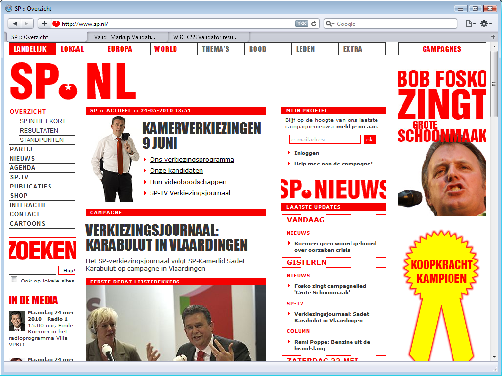
The site for the Socialistische Partij (Socialist Party) seems slightly less busy than last year. It looks like there is some white space along the top, but the disappointing truth is that it is supposed to show a silly Flash app. It is still a site that shouts its messages, but that is very much the SP house style.
Last year, I had to note that the SP lied about their site being valid, this year I am happy to report that the home page validates. Well, it passed the mark-up validation once, but when I retried later to confirm the result, it did not validate again.
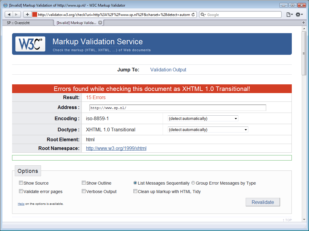
The SP additional claims valid CSS, but that is an unabashed lie. If
they had bothered to check, they would have noticed display:blok;, a misspelling
for display:block; (the Latin Small Letter C is missing),
and a dozen other errors.
The VERKIEZINGSJOURNAAL: KARABULUT IN VLAARDINGEN
item seems to be just one
sentence long. Truth is that that there is supposed to be a Flash video between
the title and that sentence, and that the SP did not use a placeholder image,
and coded their site such that you do not even get a large white space to alert
you that you are missing something.
The site seems to fit the viewport perfectly, but that is not because the SP site uses a liquid layout. It is because their site has a fixed sized created for screens 768 pixels wide. Those with higher resolutions get to see a large white border on the right side of the site of the content.
It fairly easy to find the SP’s political viewpoints; the top level item of
the menu along the left is always expanded to show three items, and the third
one is standpunten
.
It is also easy to find out what the SP thinks about hot election issues. The SP does not have a separate election site. Instead, the top item on their
site links the their election pages. The first link in the block
KAMERVERKIEZINGEN 9 JUNI
(Lower Chamber elections [2010] June 9) is Ons verkiezingsprogramma
(Our electoral program).
4. Volkspartij voor Vrijheid en Democratie (VVD)
The Volkspartij voor Vrijheid en Democratie (People’s Party for Freedom and Democracy) site has a clear house style, that uses the blue and orange colours
of their logo shown in the upper left for headings and emphasis. There is a
clear but somewhat odd menu along the top, that uses two different font sizes
with the same menu. There are lots of links in the footer, including links that are in the main
menu, as if they consider the footer to be a second menu. The site has a
search bar (zoeken
), but it is not in a logical place, such
as directly below the menu, on the left, or on the right, but below the
first content?
There isn’t much content on the home page. The top content, a video on the left side with reactions to that video on the right side, dominates the view. That is a Flash video, and that does not work. Now, if you click on a Flahs video on the CDA or PvdA site, nothing much happens, but if you click what promises to be a video on the VVD site, you get this.
It seems that, although neither the CDA nor the PvdA web sites impresses, the
VVD’s web designer could still learn a few things by studying those sites.
The black noise on the home page just below the video is the top of some text that is supposed
to go to the right of the video.
Below the search, the home focuses on just two topics: the most popular topic and a current topic, and allows visitors to respond, thus using the home page as a portal to interactive content. That is a nice idea, but the main page is very dependent on third party sites, and it does not work. It aims to load content from Twitter, Flicker and YouTube, but it fails to load content from any of these.
It seems easy to find the VVD viewpoints - just choose standpunten
in the menu
along the top to find a page with an alphabetic listing of topics. There is even
an alphabet along the top that is apparently there you let you jump down the
page to that letter, but every time you try that, you actually end up on the
home page again, because the links used in the menu are relative links and the header for the standpunten
page contains the
mistaken instructions base href="http://www.vvd.nl/",
which tells the browser to jump to the home page.
A quick scan of some other pages suggests the VVD site was created by some
junior web designer who does not
know yet what base href is for, as the same error seems to be on on all
their pages, thus making sure that all relative links all over the site always
will transport you back to the home page… in short, this site’s navigation is
seriously messed up.
The base href issue is not the only coding problem. The coding
of the VVD site is pathetic; the site does not even declare a media type or an
encoding. The code contains massive amounts of white space for layout and
indentation; that may be handy when coding parts of the site by hand, but such large amounts of
superfluous white space should not make it onto the production server.
5. Partij voor de Vrijheid (PVV)
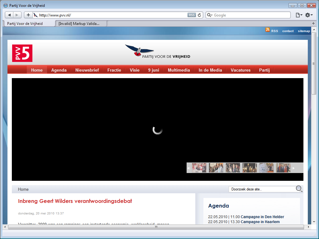
The site of the PVV has changed since last year, but it has not improved. In fact, it has deteriorated. There still is a Flash menu below the main menu, and it is even bigger than before, leaving a gaping black hole on the home page. A professional web designer would have done created the menu in CSS, but apparently the PVV cannot afford one. This second menu does not work at all, but that isn’t a great loss at all; when you allow Flash, it is not clear what each menu item leads to.
The first menu main menu is where it should be: along the top. It is a drop-down menu that works just fine, but the switch from blue to red is surprising. Most political parties choose one party colour and stick with it, so much so that they are often identified by their colours. The PVV split off from the VVD, a right-wing party using blue, so it was not surprising that the PVV used blue too. There is black and red in the PVV logo, but their current design makes you associate them with left-wing parties such as the PvdA and the SP that use red. That is just odd.
The overall design of the site is still very readable. There are two columns of contents along the left, with a top item that is two columns wide. There is an agenda of campaign events and some other stuff along the right, and a footer along the bottom. That footer has links to local other PVV sites, such as their local parties. The right column is supposed to show a video, but it uses Flash and there is a gaping hole instead.
The viewpoints of the party are easy to find. The Visie
(Vision) menu has
just one menu item: Verkiezingsprogramma
(electoral program).
It leads to a page that allows visitors to download a 60-page PDF. Although it
is nice that a PDF version is available, it is disappointing that the viewpoints
are not on the site itself.
6. Groen Links (GL)
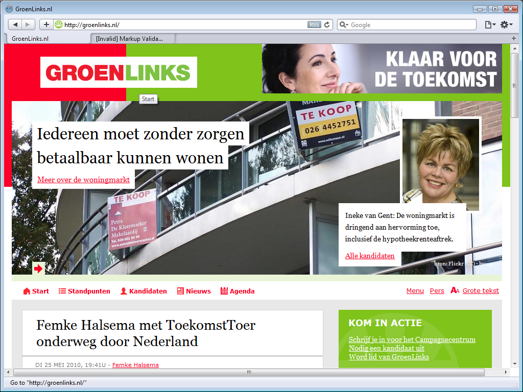
The Groen Links (Green Left) has a red with green logo and uses those two colours throught their site design. The actually have two logos, a rectangular text logo shown here, and a circular logo introduced in late 2008, wich - as remarked last year already - is remarkably similar to the logo of the Brights. Red and green are somewhat clashing colours, and the huge graphic actually along the top pushes the main menu into the bottom half of the viewport, but other than that, the site is quite readable.
The site may be readable, but it is not easy to navigate. GroenLinks apparently does not understand what a menu is for, nor what a footer is for, and is more worried about adding useless icons in front of each main menu item than about site usability.
The focus of the first top graphic I saw - the abolition of the bio-industry by 2020 - seems out of place. It is a laudable goal, but it is the kind of topic you expect from the Party for the Animals, while you expect a large party like GL to use their banner for some hot-button political issue, like the one in this screenshot; affordable homes.
Not only does the huge graphic above the main menu push that main menu down into the bottom half of the page, that main menu you see there is not a pull-down menu, the few choices on screen are all the choices there are. The thing is, there are more choices, they just aren’t on the menu. The real menu, the one with the submenu items, is in the footer! The site has a search box, but it cannot be found near the top, but at the very bottom.
Notice the Grote tekst
(Large Text) menu item at the
right end of the main menu. Not only is is very limited, as it will increase
text size just a bit and then only offer to return to normal size and so hardly
is a replacement for the resizing controls that browsers offer. It is actually
an insult; GL
implies that people with vision problerms they are so dumb that even though they regularly
need to resize web size
text, they still don’t know the browser control to do so.
The column on the right has offer TV (Flash video leave a large hole), tweets from twitter (works fine, the VVD could learn something from GL), links to various social sites where GL has a presence, and an agenda.
GL’s viewpoints are easy to find; The main menu item Standpunten
leads
to a page with the party’s viewpoints. There is no alphabetical list, but there
is a topical organisation, and the electoral program can be download as an Adobe
PDF.
7. ChristenUnie (CU)
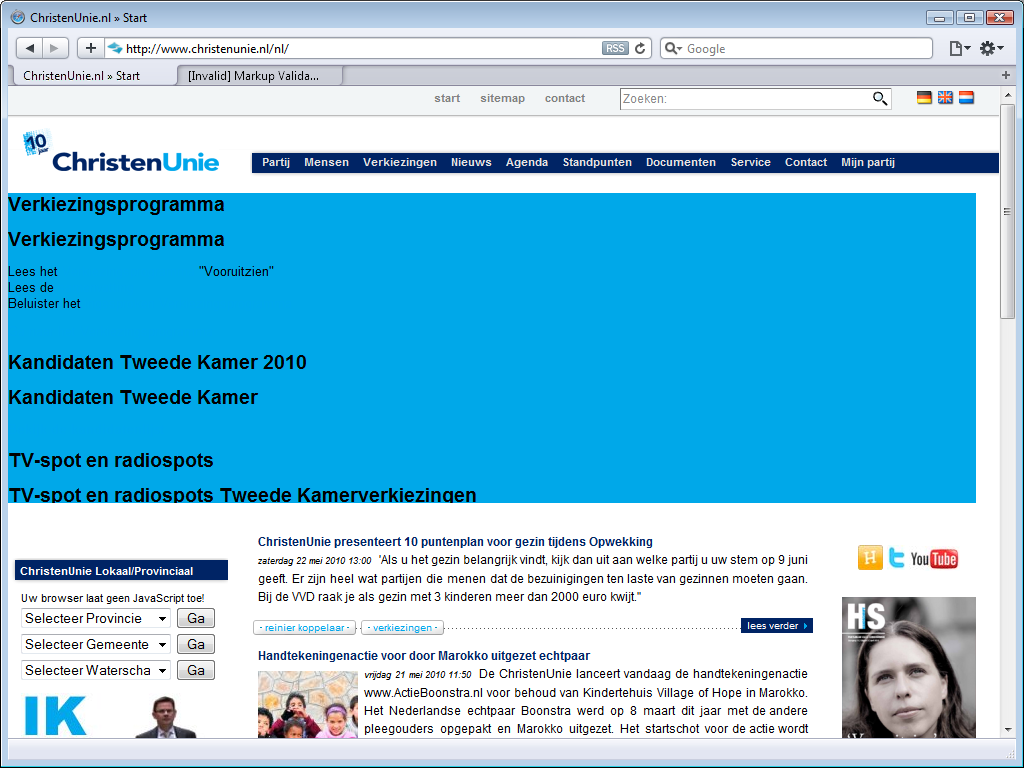
The Christen Unie (Christian Union) has a flash
banner just below their main menu, just like the PVV, but worse. When you look
at the PVV site, it is immediately clear that the banner content is not loading,
while the CU’s Flash banner is a train wreck.
Other than this banner fail and the replacement of the party logo with another
one that celebrates their 10-year existence, the site has not changed much.
The CU does not have a special election site, but it does have pages dedicated to the election and a recent news item on their site announces a race game that will allow the player to race against other parties, but with a fixed result: the CU car always wins. It seems an odd way to let the world know that you’d like to fix the elections.
The main menu is a pull-down menu that works just fine, and the menu item
Standpunten
not only leads to a page that provides both a
topical and an alphabetical index into the party’s viewpoints, but the same menu
also has links to all electoral programs and their manifest.
8. Democraten 66 (D66)
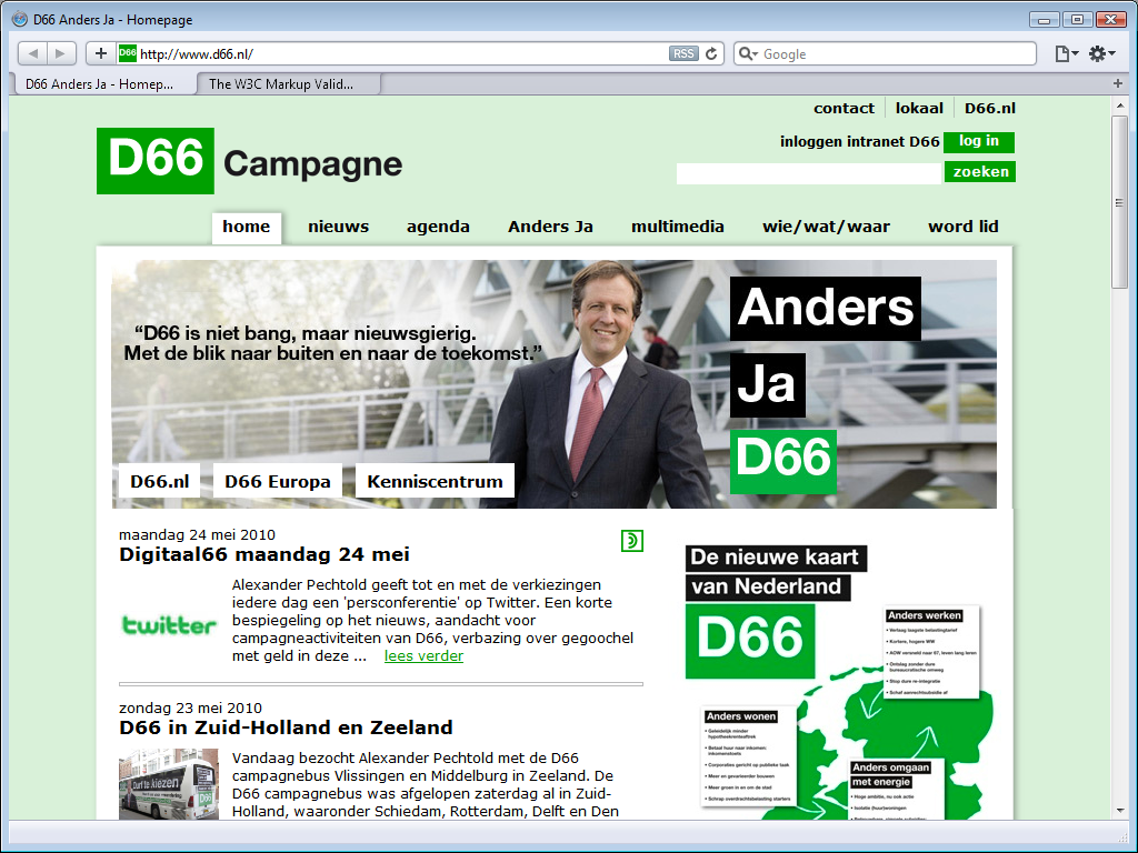
The Democraten 66 (Democrats 66) site has kept the same clean and simple look as last year. The understated colours do not detract from the site content. D66 persists in the mistake of using the site footer as a second main menu.
Their electoral program is reasonably easy to find; the verkiezingsprogramma
menu item on the Anders Ja
(Change Yes) menu leads to a page that
provides the
electoral program, but as an Adobe PDF only.
Their viewpoints on any particular subject are hard to find. There is a lot of
information on the site, but there is no topical or alphabetical list and for
hot topics their search function returns a bunch of news items.
Technically, D66 continues its slow path towards modern web design. Last year,
it was already obvious that there was some effort to use web standards, but that
effort was spoiled by the serving the XHTML page as text/html instead
of application/xhtml+xml as they they should, and the massive amount of rather
convoluted JavaScript they still used. Only some of that criticism has been
taken to heart. The page headers specify application/xhtml+xml now, as XHTML
pages should, but they are still full of unprofessionally massive amounts of
JavaScript.
9. Partij voor de Dieren (PvdD)
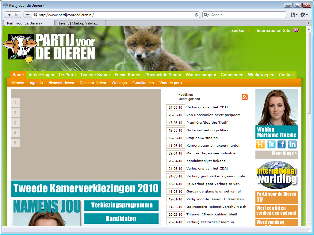
The site for the Partij voor de Dieren (Party for the Animals) is dominated by a brownish grey rectangle with a few numbers along the left side. Like the PVV, they made the mistake of using a Flash menu instead of a CSS menu.
The site hardly looks better than it did last year, the PvdD apparently still hasn’t made up its mind about a house style. The site menu uses green and orange, something you’d expect from the CDA, a party they do not love. Below the brownish grey rectangle is an oddly placed menu that uses white on blue, the bar on the right uses white on orange, and other boxes on the home page uses black on white or black on light brown. What a mess. It almost makes the CDA site look good.
It is hard to like how their two-level menu works, a pull-down menu would
have better, but their electoral program is easy to find. The verkiezingen
menu item leads to a page that provides
a summary and you need to use the second level menu to find the actual program,
while the De Partij
(The Party) menu item that leads
directly to the
actual electoral program. It is commendable that it available on the site as
well as an Adobe PDF download.
There is a lot of information on the site, but there no topical or
alphabetical overview of their viewpoints and the search function (upper right
corner) does not work.
10. Staatkundig Gereformeerde Partij (SGP)
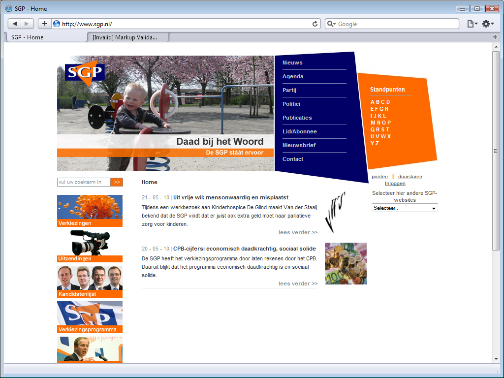
The site for Staatkundig Gereformeerde Partij (Political Reformed Party)
has a fixed-width design that seems created for visitor still using a monitor
with a maximum resolution of 800 x 600 pixels. That was dated the day the
introduced this design back in 2006. The site does have clear style that makes
good use of the logo colours.
The top-right menu looks a bit odd, but the real problem is that is does not
work. The SGP does not have web site, it has a JavaScript site. For some
unfathomable reason, the menu does not use links to other pages, but scripts
instead. Although I called attention to this a year ago, the SGP has not made
any effort to turn back to the right path, but continues its erroneous ways.
There seem to be only two topics on the site. There is a third topic, but it starts with a Windows Media file that relies on a non-standard Microsoft plug-in, represented here by a white rectangle on a white background.
Their viewpoints seem easy to find. The alphabetical list of viewpoint is right on the home page, but the menu does not work, so it is not possible to read their viewpoints.
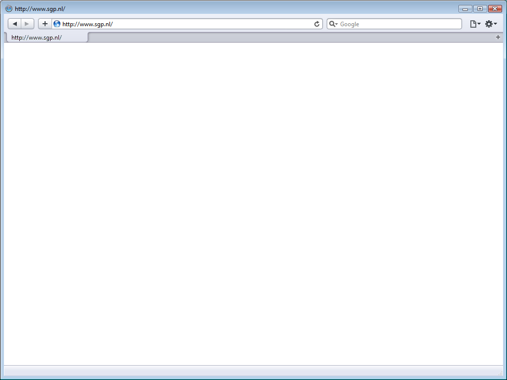
The SGP is unique in that they alternate between two different sites. During the first six days of the week they show a normal site, on the last days of the week you got to see another, one-page site instead with a brief message. At least, that is what they still did last year. This year, they showed a completely blank page. This may mislead you into thinking that there is no site on Sunday, but if there really was none, you’d have seen an error message. The SGP site is deliberately returning a blank page.
11. Partij voor de Mens en alle overige Aardbewoners (PvdM)
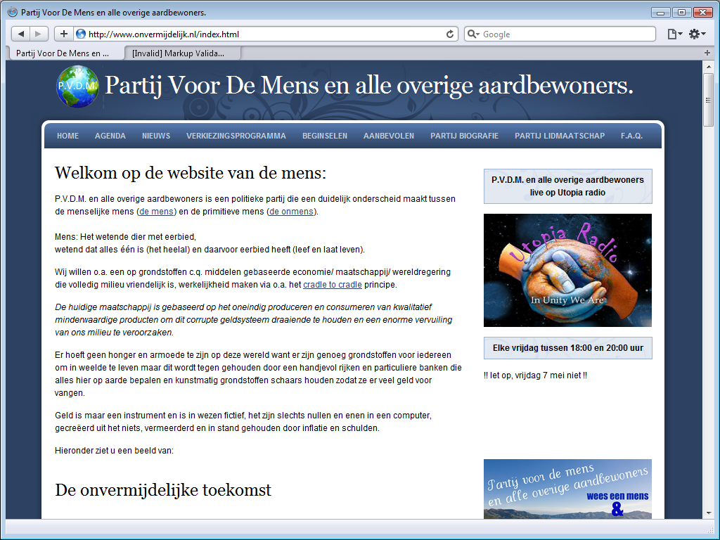
The Partij voor de Mens en alle overige Aardbewoners (Party for Humans and all other Earthlings has been disqualified from the elections, but they still have a site.
Their site is unprofessional. Sure, at first blush it looks nice, the
header, menu and footer are all in the right place, but there is this text at
the very bottom: Websites templates by JustDreamWeaver.com
. That text and
link only needs to be there when you do not pay US$ 19.95 for a template
license.
Their news page demands installation of Microsoft Silverlight.
The party does not present a list of viewpoints, but it does have an
electoral program, easily found by following verkiezingsprogramma
on the menu.
That electoral program seems to contain all the party’s viewpoints.
12. Nieuw Nederland (NN)
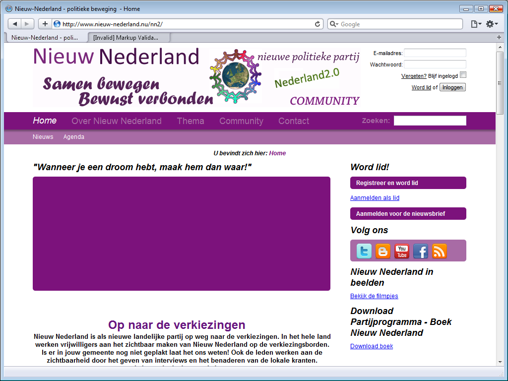
The sited for the Nieuw Nederland (New Netherlands)
party uses purple. The lighter looks fine, but the main menu with light purple
text on a dark purple background is hard to read. The header is an incredible
mess of different fonts in different colours.
The large purple rectangle is supposed to be a slide-show, but they used Flash
instead of web standards, so there is no slide-show here.
Like D66, NN makes the
mistake of repeating their menu in the footer.
Well, perhaps I should say that the main menu is a poor copy of the footer, as
the main menu item Over Nieuw Nederland
(About New
Netherlands) lacks the submenu items listed in the footer.
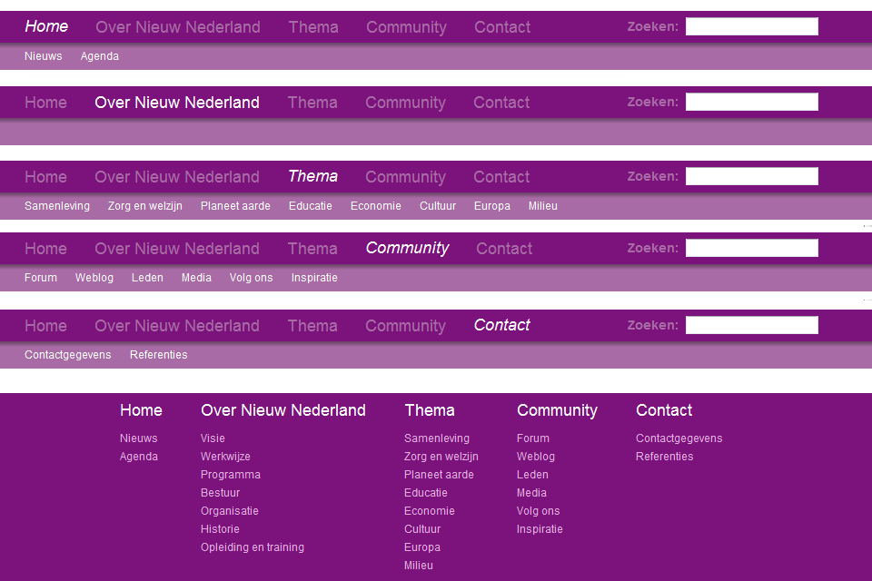
The Thema
menu item leads to a thematic overview of their viewpoints.
The link to the party’s program is somewhat hard to find, as it one of the
missing menu items. The program page provides key points and a few links to
pages with more detail. There is a download book
link, but it does provide a book for download, it actually leads to
a very long web page.
13. Trots op Nederland Lijst Rita Verdonk (ToN)
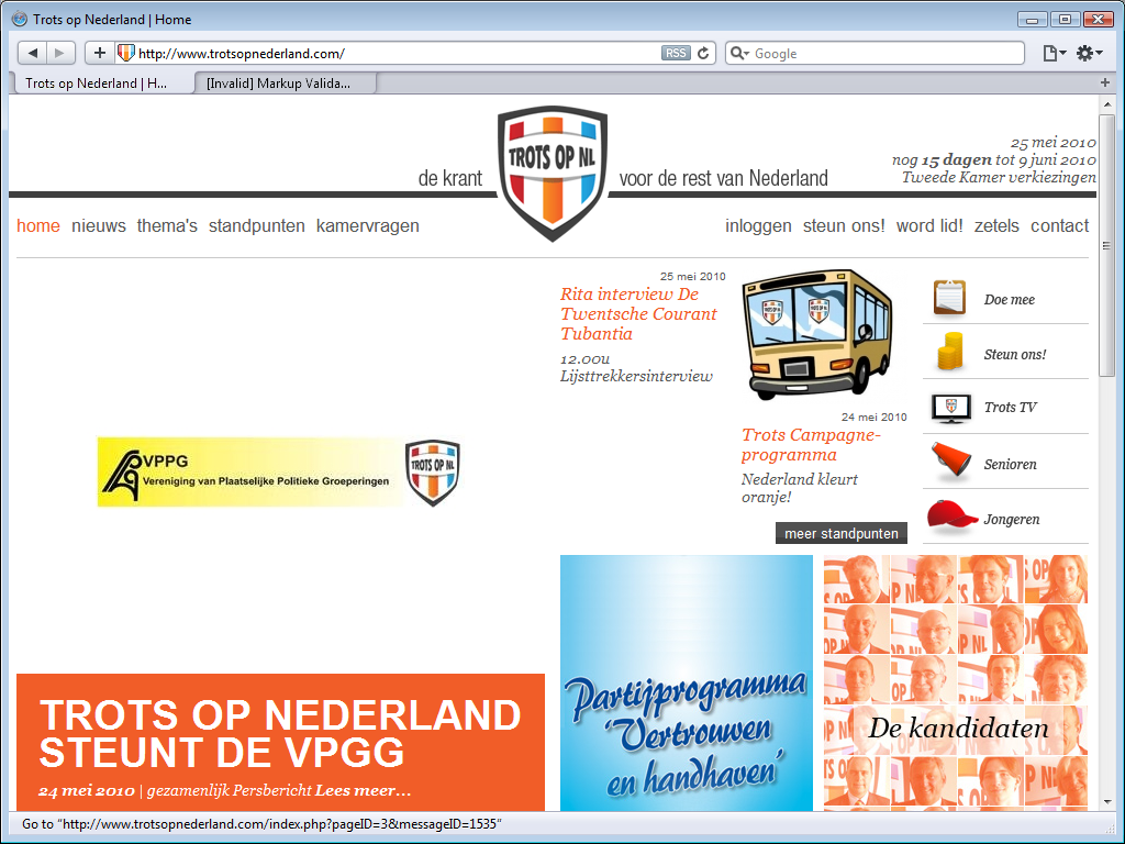
The Trots op Nederland Lijst Rita Verdonk (Proud on the Netherlands List Rita
Verdonk) site has a countdown timer to general election in the upper right. The
current site impresses even less than the purportedly web 2.0
site of a year
ago.
The mess of different fonts, colours and styles leave no room for any sense of
a house style and the placement of the deliberately football-club like logo
breaks the main menu in two parts.
The large white space around the black-yellow VPPG logo does not look right, but
that is really what the site is like; the image used there is a lot larger than
the logo it contains.
Two things that are good about this site in comparison to several other
political sites is that the footer is used as a footer and they have working
twitter integration; one of the boxes on the home page shows the latest tweet
from party leader Rita Verdonk.
The viewpoints of the party are easy to find; the main menu item standpunten
leads to
an alphabetical list of topics.
14. Partij voor Mens en Spirit (MenS)
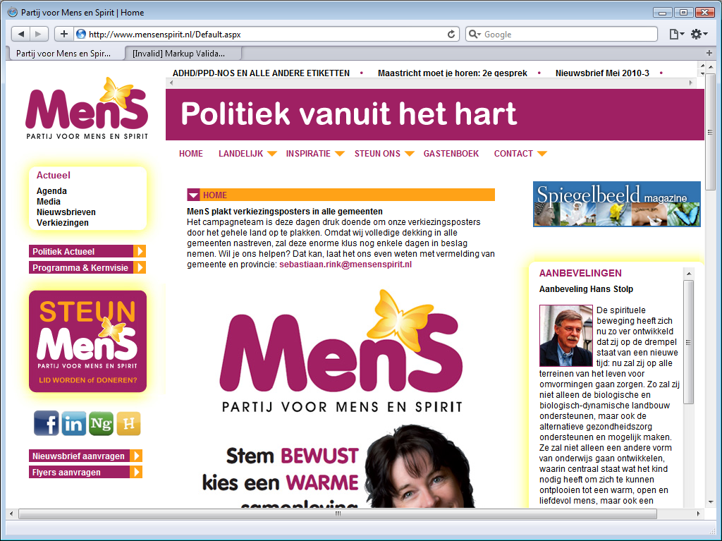
The Partij voor Mens en Spirit (Party for Man and Spirit)
is hard to navigate. What may look like a menu above the Politiek vanuit het
hart
(Politics from the hart) slogan are merely links to some highlighted
site pages. The main is menu is below the slogan.
That is somewhat disorientating already, what makes the site really hard to
navigate is that the menu does not work. It is supposed to be a pull-down menu,
but it does not work, limiting navigation to the top menu items.
MeNS does not seem to care about navigatibility at all and commits one of the most annoying web usability sins: a scroll bar on the page. The page is in fact actually long enough to present the same item without a scroll bar.
It is possible to navigate to the page with their electoral program by using the links on the lift side of the page. Their electoral program is only available as an Adobe PDF file. There is no topical or alphabetical list of viewpoints.
15. Heel NL
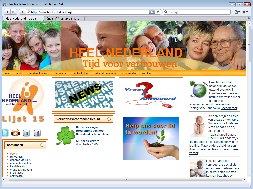
The Heel NL (All of NL) site is very busy. It is while to notice the orange menu below the large colourful banner. It is a fairly small website, and there is little information on the party. There is a list of candidates, but there is no party program. There is only a list of key points.
16. Partij één (P1)
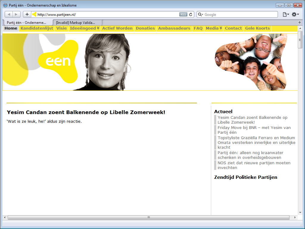
With a name like Partij één (Party One), it is hard to accuse this new party of a lack of ambition, but just as hard to not doubt their sense of realism. The site is remarkable slow to load, they really need to upgrade to a better hosting plan.
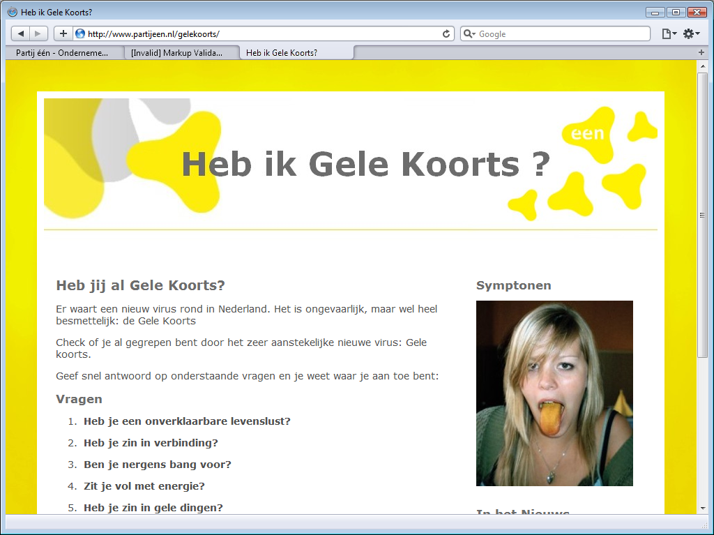
P1 has a yellow log, a yellow menu background and the last main menu item is
gele koorts
(yellow fever), a rather unfortunate choice of words that
seems to betray unawareness of the actual diseases. There even is a special heb
ik gele koorts
(do I have yellow fever) campaign page, which claims that yellow fever
is harmless.
The home page is very empty. There is a large banner below the menu, but
there is a gaping white hole below that banner. This is because there is Flash
content there, with not even a placeholder image.
The site has a footer that is so large that it does not even fit the browser
viewport!
The party does not have an electoral program, but the main menu item
Ideeëngoed
(Our Ideas) has a submenu that is a topical index to their viewpoints.
17. Blanco lijst met als eerste kandidaat Feijen (L17)

The Blanco lijst met als eerste kandidaat Feijen (Nameless party with first candidate Feijen) is really nameless, because they not decide upon a name in time.
Their original name is Lijst 0
(List 0), after the
eponymous TV program started by one of the Dutch public TV stations. That
program started in 2002, but it was only in 2010 that participants created a
political party with the same name. They soon
decided to change their name to LEF (Liberté, Égalité, Fraternité),
but that name was already taken by a local political party. There was an leaked
email about changing the name from FEL to LEF, but the party is currently
nameless, and is generally known as Lijst 17
(List 17).
Their web site does not impress. Like the SGP site, the L17 site is a fixed-sized design created for monitors with 800 x 600 resolution. There are two menus, one above the banner, and one below the banner. There should be a four-button menu next to the screenshot, but there is none. There are supposed to be visitor comments and party tweets on the home page, but neither the comments nor the tweets show up.
The main menu item
Ons Programma
(Our Program) leads to a brief introduction
and a downloadable Adobe PDF. The program is not on the site. There is not
topical or alphabetical topic index either.
18. Piratenpartij (PP)

Here be pirates. The Piratenpartij (Pirate party) is the Dutch party inspired by the Swedish original. I find it very unpiraty of them that their site does not conform with open web standards. That large medium grey field below the black banner plus menu - it is supposed to show some quotes from the party program, but it isn’t done with web standard, so it remains a large grey expanse.
The black and grey design is specific to the Dutch pirate party. Pirate parties in other countries are considerably more colourful. I do find it stylish, and it’s that there isn’t a single bold colour to detract from their message, but it is boring and uninviting as well.
The site seems easy to navigate, but a lot of links they put in the footer should really be on the main
menu. The main menu item standpunten
leads to summary of
their party program, and a link to the full one. That program is topical and
there is no alphabetical index.
19. Evangelische Partij Nederland (EPN)
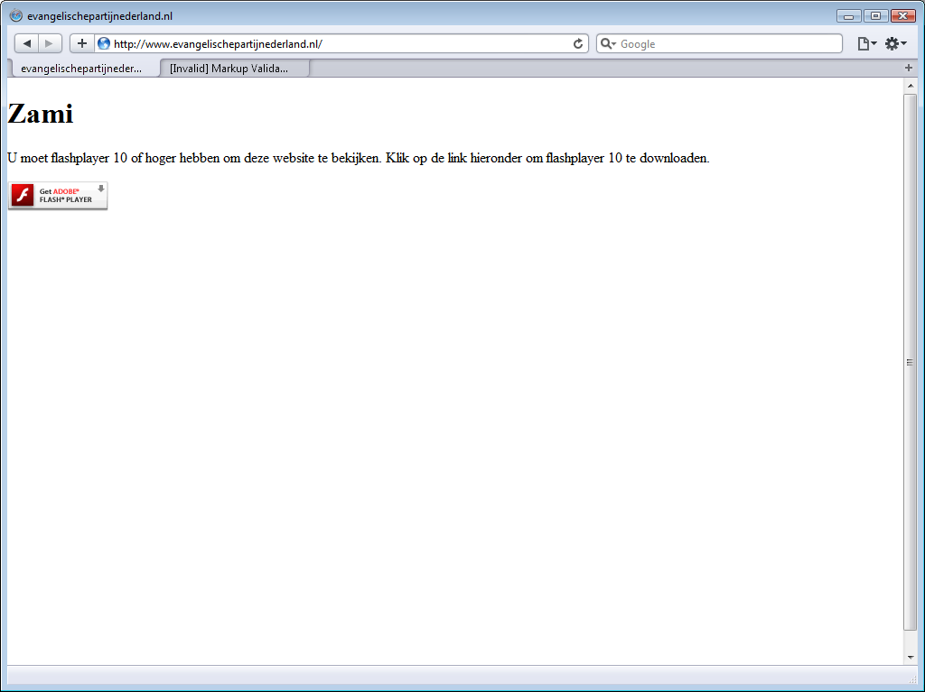
The site Evangelische Partij Nederland (Evangelical Party Netherlands)
isn’t a web site at all. It is a Flash site, and it does not work.
There is no information on the party, its program or viewpoints here, only a
Dutch text that says you must install Flash player 10 or later.
page quality
validation
Each party’s home page was evaluated by the W3C Mark-up Validation Service. In a few cases an additional site or page was evaluated. Out of 21 evaluated pages, only 2 were free of errors and warnings: the SP home page and the PvdA election home page, but on retest, the SP home page did not validate.
For those two cases, I had the CSS style sheet evaluated by the W3C CSS Validation Service. The CSS used by the SP did not validate, but the CSS used by the PvdA did validate. This makes the PvdA election home page the only page to pass mark-up and style validation.
Of those two, only the SP has buttons on their home claiming that their site validates against both the XHTML 1.0 and CSS standards. Just like last year, those two button are lies. Even their home page does not consistently validate against either standard.
| party | doctype | media type | encoding | errors | warnings |
|---|---|---|---|---|---|
| CDA | XHTML 1.0 Strict | text/html | UTF-8 | 21 | 10 |
| CDA election | XHTML 1.0 Transitional | text/html | UTF-8 | 25 | 0 |
| PvdA | XHTML 1.0 Strict | text/html | UTF-8 | 66 | 42 |
| PvdA election | XHTML 1.0 Strict | text/html | UTF-8 | 0 | 0 |
| SP | XHTML 1.0 Transitional | text/html | ISO-8859-1 | 15 | 0 |
| VVD | XHTML 1.0 Strict | none! | none! | 38 | 30 |
| PVV | XHTML 1.0 Transitional | text/html | UTF-8 | 32 | 20 |
| GL | XHTML 1.0 Transitional | text/html | UTF-8 | 67 | 0 |
| CU | XHTML 1.1 | text/html | Windows-1252 | 34 | 1 |
| D66 | XHTML 1.0 Strict | application/xhtml+xml | Windows-1252 | 8 | 1 |
| PvdD | XHTML 1.0 Strict | text/html | Windows-1252 | 8 | 1 |
| SGP | none! | none! | none! | 118 | 16 |
| PvdM | XHTML 1.0 Transitional | text/html | UTF-8 | 26 | 0 |
| NN | HTML 4.01 Transitional | text/html | UTF-8 | 2 | 4 |
| ToN | XHTML 1.0 Strict | text/html | UTF-8 | 21 | 12 |
| MenS | XHTML 1.0 Strict | none! | none! | 19 | 16 |
| Heel NL | XHTML 1.0 Transitional | text/html | UTF-8 | 21 | 0 |
| P1 | XHTML 1.0 Transitional | text/html | UTF-8 | 71 | 26 |
| L17 | XHTML 1.0 Strict | application/xhtml+xml | UTF-8 | 144 | 90 |
| PP | XHTML 1.0 Transitional | text/html | UTF-8 | 11 | 0 |
| EPN | XHTML 1.0 Transitional | text/html | UTF-8 | 18 | 0 |
doctypes
The SGP is the only party that stills fails to specify a doctype. Nieuw Nederland (New Netherlands) is the only parties that still uses the old HTML 4.01 Transitional doctype. All other parties opted for XHTML. Many still use XHTML 1.0 Transitional, which is just a small step up from from HTML 4.01. Quite a few are using XHTML 1.0 Strict. Only the CU dared to use XHTML 1.1, but as the validation results show, was overreaching their technical expertise.
Not one political party opted to use HTML5 or XHTML5, despite several advantages, but they are technically right not to do so, as (X)HTML5 isn’t a standard yet.
media type
Most parties opted for the text/html media type, and that is fine
for HTML, but most parties opted to use XHTML, and XHTML sites should use the
application/xhtml+xml media type instead.
Although all four major web browsers (Opera, Firefox, Safari and Chrome) all
feature
excellent XHTML support, many developers use text/html with XHTML documents,
which basically tells the browser to act as if it is a HTML document.
The reason for this deprecated practice is that many visitors use Internet
Explorer instead of a web browser, and that Internet Explorer does not support
XHTML. This problem will start disappearing with the introduction of
Internet Explorer 9, Microsoft’s first web browser in a decade to support web
standards instead of thwarting them.
Although the use of text/html with XHTML 1.0 is deprecated,
Internet Explorer’s shortcomings are the major reason that it is allowed at all -
but only if the Compatibly Guidelines in Appendix C are met.
The CU commits heresy by using the text/html type with XHTML 1.1.
Three parties left out the media type! The SGP, VVD and MenS fail to
specify a media type. What’s more, all three also fail to specify a character
set or encoding. These omissions are unprofessional, plain and simple.
Two parties, D66 and L17, used the correct
application/xhtml+xml media types inside the page headers. However, both
sites still lie to your browser that it is about to receive a file with media type text/html.
That lie is necessary to fool Internet Explorer, which would otherwise
completely fail to
render the page, but both sites actually lie to web browsers as well.
There
is no need to lie to real web browsers, and the guidelines are very clear that
application/xhtml+xml should be used with XHTML whenever
appropriate, and that text/html should only be used for backward compatibility
with dated browsers. So it is okay to lie to Internet Explorer that an XHTML
page has media type text/html, but modern web browsers (and that
includes Internet Explorer version 9) should be told the truth.
character set
When it comes to character sets, most party do the right thing; they use the Unicode character in the UTF-8 encoding. That is the recommend encoding for Internet documents.
As already mentioned, the SGP, VVD and MenS fail to specify a character set or encoding. Another site that fails to do so is the SGP site.
The SP is the only party that chose to use the ISO 8859-1 (ISO Latin 1) character set. That may be good enough for most Dutch text, but XHTML sites should really be using UTF-8.
Three parties, the CU, D66 and the PvdD, opted for Windows-1252. It is hard to describe just how wrong and unprofessional that is. Simply put, their choice to use a Windows-specific code page communicates that they are not interested in your vote if you use MacOS or Linux. Web sites should not use Windows standards, but web standards.
conclusion
validity
Not one of the political sites is valid. There is a slow trend towards valid web sites, the error counts are not as high as last year, when many sites still had 3-digit error counts. This year, only the SGP and L17 have 3-digit error counts, while most sites have 2-digit error counts, a few have 1-digit error counts, and one page actually validated.
XHTML
There is also a clear move towards XHTML as the document type of choice and
UTF-8 as the preferred character encoding. A few sites make a feeble attempt to
use the right media type, but none of the political parties dares to tell
Internet Explorer users that they should upgrade to a web browser, so they all
adapt to Internet Explorer limitations instead.
The current Internet Explorer 9 Beta is a web browser, and does support
web standards, so in a few years time we may see some sites doing the right
thing, and telling user of older Internet Explorer versions to upgrade to
Internet Explorer version 9 or another web browser.
Some may even rush ahead of standardisation and opt to use XHTML5.
safe surfing
Dutch political parties do not seem eager to encourage or enable safe surfing. Use of JavaScript is still widespread. Several sites do not even not work without it, but demand that you browse unsafely by turning JavaScript on.
Flash
Some sites use Adobe Flash for one topic and Microsoft Silverlight for another, but many sites use Flash video exclusively. Flash isn’t a web standard, but a proprietary technology of Adobe Inc, and it is remarkably unreasonable to assume that it will always be available on every browser. It is famously unavailable on iPhones since the first iPhone was introduced more than three years ago, and it is not available on the new iPad either.
Moreover, even on platforms that are supported, Flash only works if the user installs a plug-in. Many corporations do not allow their users to install plug-ins, and the Flash plug-in does not work too well if the user installs a Flash blocker.
Flash menus
Use of Flash is not just widespread, but also rather careless; most often the sites do not offer an alternate format, and in many cases they do not even offer a placeholder image. Some sites do not just use Flash for movies and slide-shows, but even use Flash for menus without offering standard menus, thus seriously limiting the navigatibility of their site.
video
Web developers may not assume that non-standard formats are available, but should provide alternate content, so that each browser can pick a format it supports. Sites should offer content using industry standards such as Theora or H.264 (a.k.a. MPEG-4 AVC), or at least offer content video in multiple proprietary formats, such as Adobe Flash, Apple QuickTime and Microsoft WMV.
The WebM format is so new that it would be surprising for any political site to already support, but it is certainly attractive; a video format supported by multiple browser vendors, no plug-in installation required.
final fallback format
However many or few video formats a site offers, it should always offer a placeholder image as a final fallback format. Several sites make two mistakes on top of each other; they offer a Flash video without offering the same content in any other format, and then also omit the placeholder image. The result is a gaping hole in the website, without any indication why that hole is there.
fixed-width
It is surprising how many of these are still fixed-width designs that are awkwardly large on relatively low-resolution smart phones and ridiculously small on high-resolution desktop screens. Off all these sites, the D66 site is the only one with a liquid layout that automatically adapts to the width of the your browser viewport.
web 2.0
Not one political site handles video correctly. Many sites try integrate some
web 2.0
into their site, but GL
and ToN are the only ones with working twitter integration. Others try, but
merely show a permanent wait cursor. The VVD does not even manage to load images
from Flicker.
best and worst
best
It is impossible to pick a best web site from this bunch, not for lack of
quality differences, but because the harsh truth is that none of these sites is
a great example of modern web design that deserves to be held up as an example
to the others.
Even the site for the largest parties, whose budgets are certainly large enough
to hire professional web developers, contain serious mistakes apparent after
only one hour of superficial examination.
The SP and D66 are trying to make a valid website, but clearly not trying
hard enough. The CDA, PvdD and ToN lack a clear house style. The PvdA site does
not demand that you install one plug-in for videos, but even demands that you
install two different ones. The VVD’s web 2.0
content is broken by lack of
design. GL insults people with limited vision, and their site navigatibility
would actually improve if you switched their menu and footer around. The
PVV, the CU and the PvdD feature huge non-working Flash menus as leading
content. The SGP site does not have any working menu. Ectera. No, none of these
sites deserved to be called the best political site of 2010.
worst
Each of these web sites is the worst in some aspect, but sites are especially horrendous examples of how not to make a web site.
SGP
The site of the SPG is once again the worst site of the established parties, for the same reasons as last year; it deliberately fails to work on the last day of the week, but because the site they show on the first six days of the week is a JavaScript-site instead of a web site, their site navigation does not work at all.
EPN
However, the very worst site is that of newcomer EPN. The EPN site is not even a JavaScript site, but merely a Flash app that does not work at all. They even managed to cram 18 mark-up errors in that one-sentence page that tells you that you have to install Flash.
conclusion
The low quality of the Dutch political web sites is disappointing. The established parties were involved in passing laws that demands that government web sites adhere to web standards, but apparently see no reason to set a good example. There is still so much to improve, that is easy to pick the two worst sites, but impossible to find any site worthy of being called the best.
links
Dutch National Parties
- Christen Democratisch Appèl (CDA)
- Partij van de Arbeid (PvdA) (nu.pvda.nl link broken by PvdA webmaster)
- Socialitische Partij (SP)
- Volkspartij voor Vrijheid en Democratie (VVD)
- Partij voor de Vrijheid (PVV)
- GroenLinks (GL)
- ChristenUnie (CU)
- Democraten 66 (D66)
- Partij voor de Dieren (PvdD)
- Staatkundig Gereformeerde Partij (SGP)
- Partij voor de Mens en alle overige aardbewoners (PvdM)
- Nieuw Nederland (NN)
- Trots op Nederland Lijst Rita Verdonk (ToN)
- Partij voor Mens en Spirit (MenS)
- Heel NL
- Partij één (P1)
- Blanco lijst met als eerste kandidaat Feijen, L.L. (L17)
- Piratenpartij (PP)
- Evangelische Partij Nederland (EPN)
related
- Trots Op Nederland Website (2008)
- Dutch Political Web Sites 2009
- Kiesraad 2010-04-29: Kiesraad maakt nummering kandidatenlijsten bekend (Dutch)
- Kiesraad 2010-05-18: Definitieve kandidatenlijsten gepubliceerd (Dutch)
technology
- Apple Safari
- Ian Hickson: Sending XHTML as text/html Considered Harmful
- W3C: XHTML Media Types
- W3C Mark-up Validation Service
- W3C CSS Validation Service
- Theora
- WebM
Copyright © Tamura Jones. All Rights reserved.